Gust builder
Time to get familiar with the Gust page builder!
Starting Gust
There are a couple of ways that you can get started with Gust. Either from the "All Pages" / "All Posts" page or from the "Edit Page" / "Edit Post" page itself.
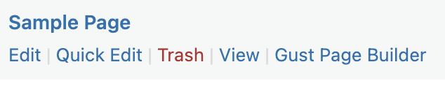
From the "All Pages" / "All Posts" page, hover over an item and select "Gust Page Builder":
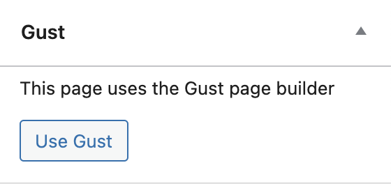
From within the edit page, scroll down the options on the right hand side and select "Use Gust":
Action bar
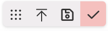
The action bar lets you move an element around the page, delete elements, and move around the DOM tree.
When clicking on a typical element you'll see something like this:
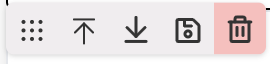
The far left icon is the drag handle. You can click and drag this to move the element around.
The up and down arrows let you select the parent or child element.
The "save" icon lets you save the element as a template. Read more about editing components.
The trash can lets you delete an element. We all have trigger fingers at times so you'll need to confirm the action before a node is actually deleted.
Some components support repeatable items. These are components like sliders, tabs, accordions etc, where you need to repeat the same layouts. When a component supports repeatable items you'll see an extra action bar. It has the title of the component followed by "items", for example "Slider items". This one has a few extra options:
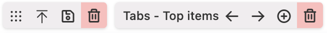
The left and right arrows move you through the repeated items. For example, if you have a slider with three slides, clicking right will move you through each one of those slides, allowing you to edit each one individually.
The plus icon will add a new item.
The trash can will delete the currently selected item. It has the same confirmation requirement before an item is deleted. For example, if you have a slider with three slides and you want to delete the last slide, click the right arrow until you see the slide you want to delete. Then click the trash can, click it again to confirm, and that slide will now be gone. You cannot delete the last remaining item.
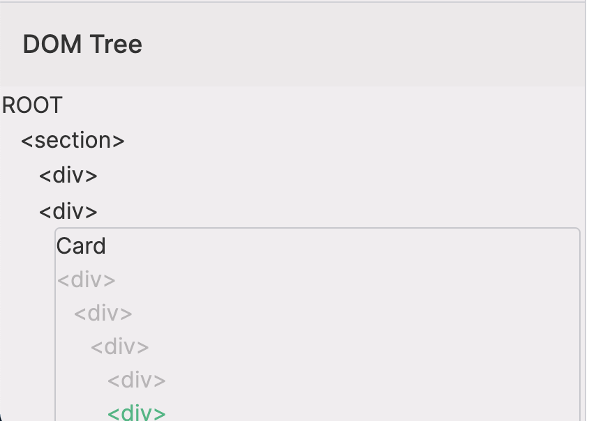
DOM Tree
For general users you won't need to use this panel much, but for those needing some fine grained control you can use this panel to select the exact element you need. You can also drag nodes around from here and you can drag elements and components into here.
Some options are also only available by using the DOM tree. For example, with repeatable elements, clicking the tab on the page will select the item and enable you to modify that item, but clicking the associated element in the DOM tree will let you customise the actual repeated element.
Import HTML
One of the easiest ways to get content into Gust is to import HTML that you've built elsewhere. This might have come from a template you purchased or a third party page builder. Either way, you can now click the "Import HTML" button, drop in some valid markup and this will be added to your page.
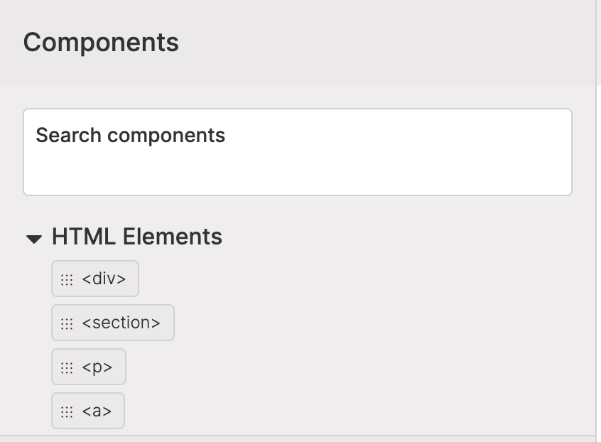
Components Drawer
Once you're into the Gust page builder the Components Drawer is one of the key sections you'll be interacting with while building pages. From here you can find HTML elements and pre-made components. Click on each category header to expand / close it, or use the search to filter elements.
When you expand a category you can click and drag the element onto the page or down into the DOM tree. You can drop a component anywhere, but you'll notice that when you hover over an element you will see a bunch of arrows show up. Hovering over one of those arrows will add the dragged element before or after the hovered element.
Adding content
There are a few different ways that you can add content to a component or element.
Content
This option is selected by default. It will let you add plain text content to an element and is the most basic form of content.
Rich Text Editor
Gust comes with a built in Rich Text Editor. Selecting the RTE option lets you add headings, links, colours, and other formatting options to your text.
Post meta
If you use something like Advanced Custom Fields, you might set custom data on a post or a page. You can use display this data in Gust by selecting "Post Meta" as the content type and adding the meta key. Read more about dynamic data.
Filters and Functions
Sometimes you just need extra control over the content in a component or you need to keep that content dynamic. To do this you can use a filter or a built in WordPress function. You can set any filter you like by adding the filter name, but there are only a few vetted functions you can use that WordPress provides out of the box. If you want to see more of these, get in touch with support and send us your ideas. Read more about dynamic data.
Context property
If you have an item in context ( e.g. the current post, or the current item in a loop ) you can reference a property of that item. This is the equivalent of referencing $item->[$property_name] or $item[$property_name] in php.
Class Names & Extra Class Names
When you add normal HTML elements, you'll be able to modify the class names for that element. But when you're working with components that have been pre-made you may want to modify or add to those class names. In this case you'll be able to add extra class names, or override the class names provided by the component.
If you add extra class names, these will be added to the class names rendered on that component. E.g if the component has p-4 and you add m-4 in the "Extra Class Names" input, the element will render with p-4 m-4. If the component is updated in the future to have p-2, it will be rendered with p-2 m-4. This is a non-destructive edit.
If you choose to override the component class names, this will override any future updates to the component, as well as any class names for this instance of the component. For example, if the component has p-4 and you change that to p-2. The component will be rendered with p-2. But if you add another component further down the page, it will be rendered with p-4:
<div class="p-2"></div>
<!-- first instance of the component -->
<div class="p-4"></div>
<!-- second instance of the component -->
If the component is updated in the future to have p-8, the following will be rendered.
<div class="p-2"></div>
<!-- first instance of the component -->
<div class="p-8"></div>
<!-- second instance of the component -->
You can read more about components to find out how class names are added and displayed.
Attributes
You can add HTML attributes to any element. For general users you probably won't need to play with this section often, but it's helpful to know it's there:
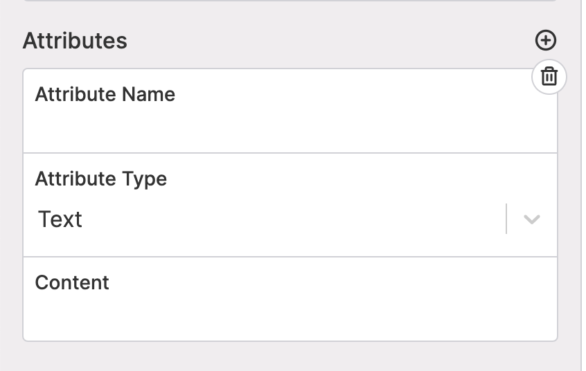
Attributes can be:
- a simple text value
- the return value from a filter
- the return value from a common function
- post meta
Read more about using filters, functions, and post meta in the dynamic data docs.
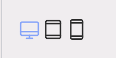
Screen sizes
You can preview what your page is going to look like on different screen sizes by clicking either the desktop, tablet, or mobile icons. The current size is highlighted in blue.
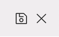
Save & Exit
Don't forget to save all your hard work! Clicking the save icon will save your content and you'll see a loading spinner while it does so. Once you're done you can click the "x" to take you back to the WordPress edit screen.